 on 25 August 2026
 Customizable ERP interface: set up your screen the way you work
A workspace that adapts to you
The DoliPlus customizable ERP interface goes well beyond colours. Everyone now sets up their screen to match the way they work. Here is what you gain:
- Two working modes — Classic or Studio — switched with a single click, like light and dark.
- Four menu layouts, including a side column with keyboard search and pinned favourites.
- Your own colours, in light or dark, with three display densities.
- The Signals ✦ column: your lists point out by themselves what deserves a phone call.
- A morning brief that sums up your day as soon as you open the home screen.
- A sign-in page in your colours, comfortable right down to a phone.
- Lighter records: your screens open on the eight useful properties, the others stay counted one click away.
In short, your software adapts to you rather than the reverse. And every setting belongs to your own account: your colleague keeps theirs, even on the same screen.
Two ways to work: Classic or Studio
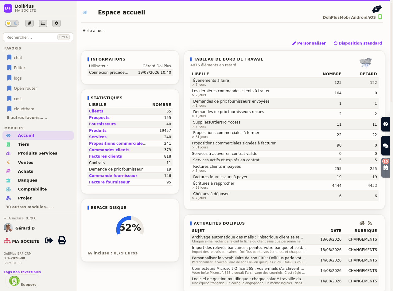
Classic mode is the one you already know: the menu bar at the top, your habits untouched.
Studio mode offers another way of working. It replaces the bars with a single, calmer column on the left that gathers everything in one place: keyboard search (Ctrl + K), your pinned favourites, the list of your modules and your account. You reach any screen without letting go of the keyboard.
The choice is never final. The switch stays visible at the top right, next to the light/dark selector — one click brings you back to Classic. You can try Studio for a day at no risk.
The side preview: line details without leaving the list
In your lists, one click on a row opens a preview panel on the right of the screen. Therefore, you get the essentials of the record without leaving the list and without losing your filters.
The preview currently covers:
- the customer list: contact details, unpaid balance, latest activity and contacts;
- your sales orders: customer, amounts, invoicing status and ordered lines;
- orders ready to ship: the same summary, straight from your picking screen;
- invoices, whose lines unfold beneath the row you clicked, along with payments already received.
Moreover, each line shows the product name, its quantity and its amount. Consequently, you check what a document contains at a glance. Then the Esc key closes the panel and hands your list back.
A lighter screen: records open on what matters
A customer record or an invoice shows 20 to 40 properties at once. Newcomers therefore do not see a rich tool: they see a wall.
The customizable ERP interface answers with hierarchy rather than deletion. Consequently, every record now opens on the eight properties you use daily.
Above all, nothing is lost. The others stay announced and counted at the bottom of the card: “23 more properties →”. One click brings them all back.
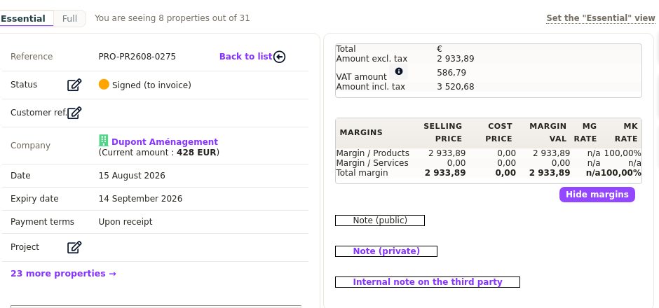
The “Compact / Full” bar, just above the record, lets you build your own selection with a star. Moreover, thirteen records arrive ready, and the administrator sets the starting point for the whole team.
Everything about the Compact view of records
The main menu can appear in four different shapes. You move from one to the next with a dedicated button in the top bar, and your choice is remembered from one session to the next. See the chapter on navigating DoliPlus.
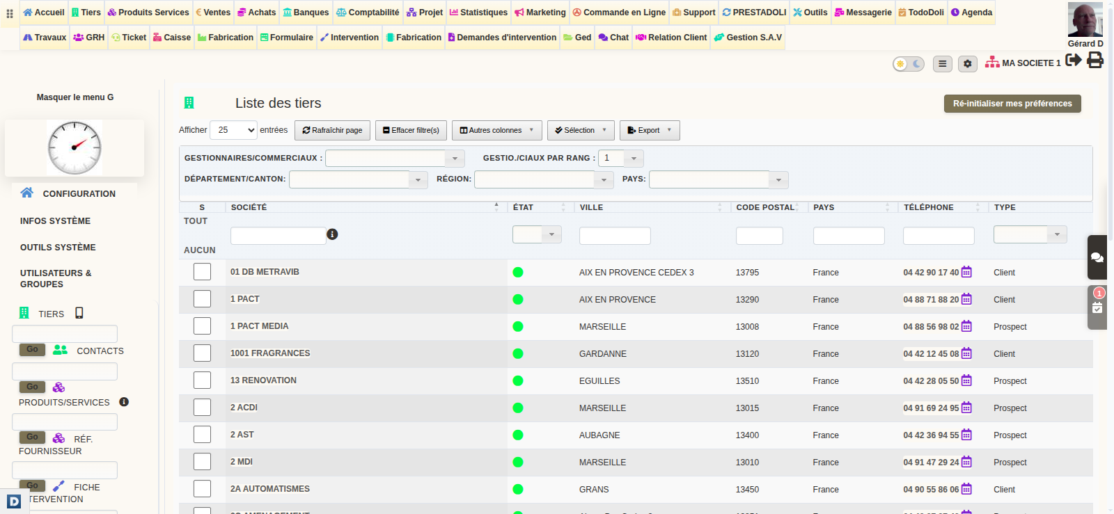
The full menu is the default: every major module lined up horizontally at the top of the screen, with its icon and its label. Hover an entry and its submenus unfold. Ideal when you have the full width of your screen.
The compact menu shrinks the top bar down to a single row of icons, the label appearing on hover. You win back screen height while keeping every module one click away.
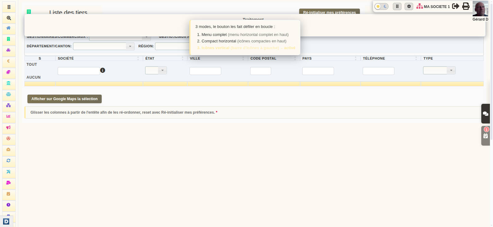
The vertical menu moves to the left-hand side as a slim bar of icons. Hover one and the full menu unfolds beside it. This frees the entire width of the screen for your content.
The column menu keeps the whole navigation in a single left column, with keyboard search and your favourites at the top — the layout Studio mode uses.
Every page tells you where you came from
You open a customer record from a list, then an invoice from that record. Three screens later, you no longer know how you got there — and if the page opened in a separate tab, your browser’s “Back” button does not even respond. Therefore, a breadcrumb now sits at the top of every page and retraces your route:
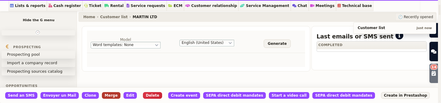
Every step is clickable. One click on “Customer list” takes you back — and not to an empty list: you find your filters and your search exactly as you left them.
It holds up, even in a tab opened on the side
That is the whole point. Many screens deliberately open in a new tab, so that your list stays within reach. In such a tab, the browser history is empty. The breadcrumb, however, still knows where you came from. Moreover, it survives sorting a column, moving to another page and saving a record: in other words, it stays there at the very moment you need it.
“Recently opened”: finding what you had in front of you
On the right of that same line, a button lists your latest pages, across all tabs. Thus, a tab closed a little too quickly reopens in one click. It is also your safety net when you arrive from a link received by email or from a bookmark: in that case there is no route to retrace, but your working history remains available.
Nothing to install, nothing to learn
The breadcrumb appears on its own, on every page. The names it shows are your own menu labels — so, the wording you already know — and you only ever see the screens you are entitled to. Finally, your administrator can switch it on or off from the theme settings, together with the other display options.
Your colours, light or dark
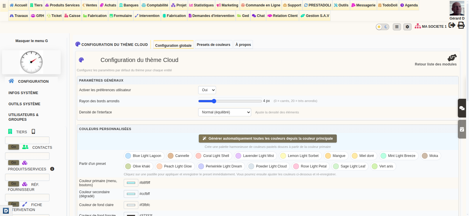
Pick your main colour, switch between light and dark, and choose one of three display densities depending on whether you prefer breathing room or as many lines as possible on screen. Contrast is recalculated for you, so text stays readable whatever colour you choose.
Lists that point out what matters
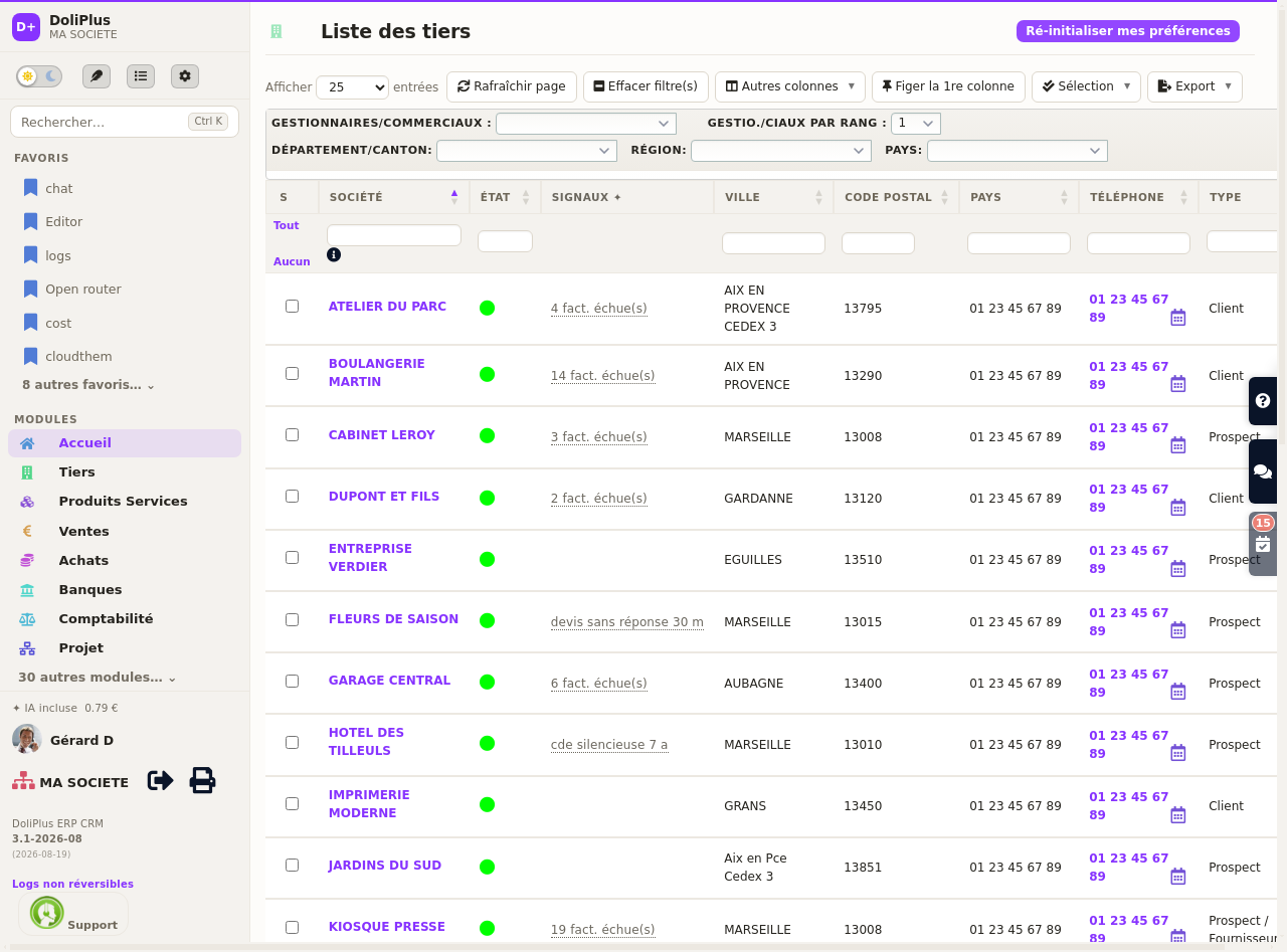
The Signals ✦ column reads your lists for you and flags the records that deserve attention — an overdue invoice, a quote about to expire, a customer gone quiet. You stop scanning a hundred rows to find the three that matter.
On a tablet, and on a phone
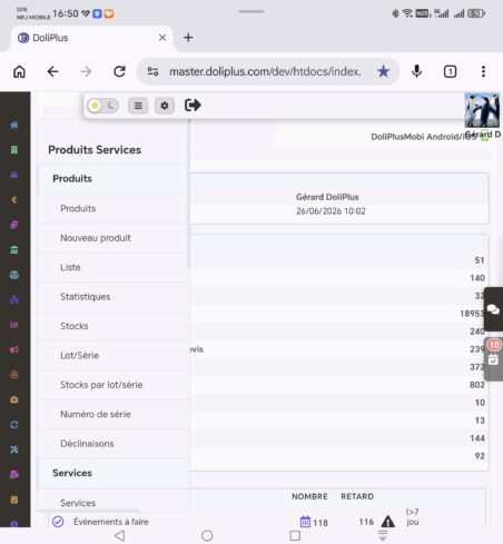
On a tablet the page stays organised in columns and the menu adjusts so nothing overflows: records keep their two-column layout whenever there is room, so you lose no information. See also: the DoliPlus menu on iPad.
On a phone, the menu becomes a slim vertical bar of icons, pinned to the left and always visible. Since an icon alone is not always self-explanatory, one gesture is enough: slide your finger along the bar and the name of the module under your finger appears in a label beside it. You explore the whole menu with a single swipe, without opening anything.
To enter a module, tap its icon: a panel slides in from the left and shows the submenu on two levels — section titles in bold, then their entries just below. Everything fits in one column, comfortable to browse with a thumb. If your menu is long, the bar scrolls on its own as your finger nears the top or the bottom.
How to change the display
Everything happens without leaving your work, from the buttons grouped at the top right:
- To change working mode, click the Classic / Studio button. One click is enough, and one click brings you back.
- To change menu layout, use the neighbouring button. Each click cycles through the four presentations.
- To move between light and dark, flip the sun / moon switch right beside it.
- For colours and density, go to Setup > CloudTheme — or, if your administrator allows it, through the “My own colours” shortcut.
Your preferences are saved on your account, so you find them again at your next sign-in, on any device.
Your documents change too
The new design does not stop at management screens: the file explorer takes on your colours as well, in light and in dark. It also gains pinned folders, a preview panel on the right, and full-size reading of your PDFs, images and text files. Discover document management in DoliPlus.
Going further