 on 21 August 2026
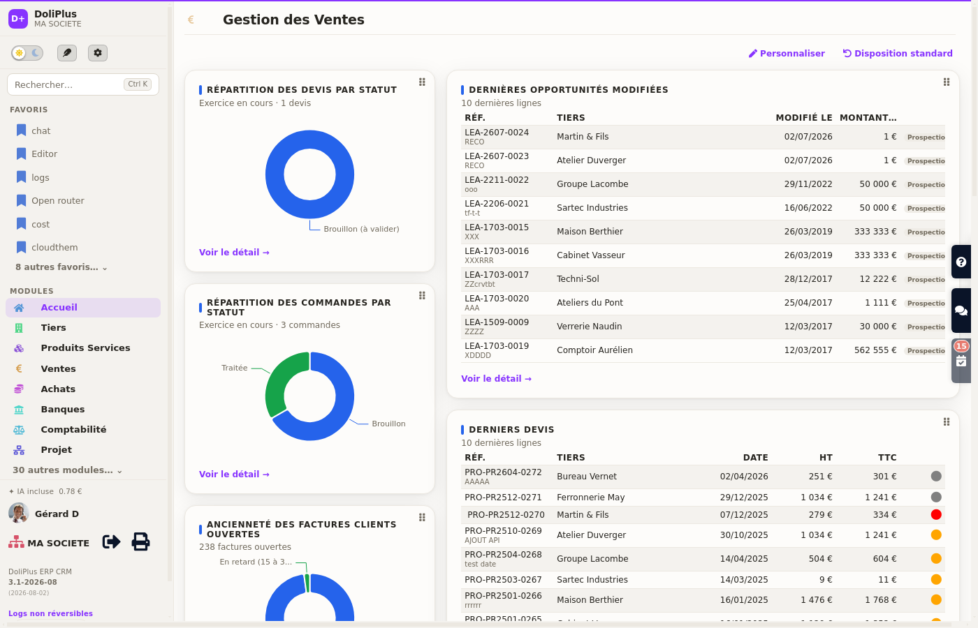
 The kpi dashboard software built into DoliPlus shows your figures as soon as you log in, on the home screen and on every business screen:
- close to 150 ready-made indicators, with nothing to program;
- indicators that point out what is missing: prospects never quoted, products without a purchase price;
- one click on a figure opens the exact list of records behind it;
- everyone builds their own screen: add, remove, move, change the period;
- a template per team, prepared by the administrator, avoids the empty page;
- the very same screen on computer, tablet and smartphone.
In other words, you stop hunting for your figures through the menus: they come to you instead, up to date, right where you already work.
DoliPlus is the enhanced cloud edition of Dolibarr, extended with modules built for daily business use.
The time lost looking for a single figure
In most business software, the answer does exist. Finding it is another matter. First you open a menu, then a submenu, then a filter, and finally an export. Therefore, simply knowing how many quotes are still awaiting an answer takes three minutes and five clicks.
That detour repeats every day, for every question. As a result, many managers give up: they steer on gut feeling, or they wait for the year-end accounts. This is exactly what a well-designed dashboard removes.
Kpi dashboard software on the home screen and on every business screen
DoliPlus places indicator cards straight onto the screens you already use. For example, the Sales page shows your quotes by status, your latest orders and your current invoices. Likewise, the Purchasing screen displays what you owe your suppliers.
The home screen, Sales, Purchasing, Banks, Projects, Customers, Products, human resources, support tickets: some fifteen business screens each receive their own indicators. Therefore you no longer go “and look at the statistics” somewhere else — they are already where you work.
Each card takes the clearest possible shape for its subject: a large figure with its trend, a pie chart, a ranking of your best customers, a target gauge or a table of the latest records.
Click the figure, and you get the records behind it
An indicator you cannot check is worthless. That is why every figure in DoliPlus is clickable. Does the card announce 238 open invoices? Then one click opens the list of those 238 invoices, exactly — no more, no less.
Therefore you move from observation to action without a break: you see the figure, you open the detail, then you chase the customer concerned. Moreover, every slice of a pie chart behaves in the same way.
The list that opens remains a full dynamic table: you therefore keep your filters, your columns and the export to Excel or PDF.
The indicators that tell you what is missing
A dashboard usually tells you about the past: what you sold, collected and delivered. However, the most profitable decisions often concern what has not happened yet. Therefore, DoliPlus also provides indicators of absence.
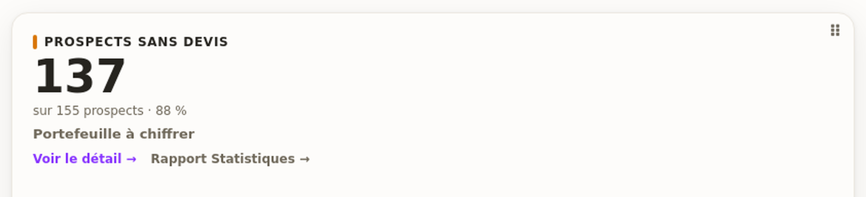
“Prospects without a quote” is the clearest example. The card counts the prospects in your file who have never received a single quotation. Then, one click opens the list of those prospects, and of no one else. As a result, you know exactly who to call this morning.
The catalogue applies the same logic elsewhere. For example, “Products without a purchase price” lists the items whose margin cannot be calculated, because no cost price was entered. Similarly, the Purchasing screen highlights orders running late on delivery.
Consequently, these cards turn your screen into a work list. In other words, you no longer read a result only: you also see what remains to be done to improve it.
Finally, these indicators keep a second and more discreet link to the matching detailed report. Thus, you remain free to dig into the subject by period, by family or by sales representative.
Building your screen in a few clicks
We switch this feature on for your DoliPlus on request: tell us which screens you want your indicators on, and we open it on your installation. After that, each of your colleagues builds their own.
- Click Customise, at the top right of the screen.
- Add an indicator: the gallery offers those relevant to the page first, then all the others.
- Move a card by grabbing its handle, at the top right.
- Adjust it with the cog: period, accent colour, width, number of rows.
- Remove whatever you do not need. Finally, Standard layout restores the original screen if you change your mind.
Every setting belongs to you alone. Your colleague therefore keeps theirs, and nobody has to live with someone else’s layout.
Your own lists become indicators
Does the catalogue miss your question? Then create your own view and build custom reports: you either ask the assistant in plain words, or you compose the list yourself without writing a line of code.
That list is then added to your dashboard like any other indicator. In other words, even your most specific need fits on your home screen.
Your indicators follow you on smartphone and tablet
On a small screen, room runs short: showing the same cards side by side would make them unreadable. DoliPlus therefore rearranges the screen on its own. Tables come first, since those are what people consult on the move, and charts follow underneath.
A table wider than the screen is read by sliding it with a finger, and no column ever disappears. You therefore keep the whole picture, from the desk to the phone.
For the administrator: a standard dashboard per team
A newcomer who lands on an empty page never uses it. That is why the administrator prepares templates per user group: one for the sales team, another for buyers, a third for management.
On their first visit, the user receives a copy of their team’s template. They then adjust it freely. However, the administrator can lock certain cards: sales targets, for instance, stay on display for everyone.
Everyone their own indicators, everyone their own language
Do your teams speak several languages? Each person sets their display language on their own user record, and their cards follow immediately. Therefore your French-speaking manager and their English-speaking colleague open the same home screen, each in their own language, on exactly the same figures.
Indicators are calculated, then kept for a few minutes so that your screens stay fast. DoliPlus now keeps one set per language: the first person to log in therefore no longer imposes theirs on everyone who follows.
For the detail of how this works, read our article on multilingual business software.
On the home screen, your usual landmarks stay at the top
The home screen does not ask you to relearn your own page. At the top, you first find what your teams open every day: your account information, the work dashboard, your database statistics, the DoliPlus news feed and the disk space — each one exactly where it already was.
Then a separator marks the start of your area. Above it, nothing moves: that part is the foundation DoliPlus provides. Below it, however, the dashboard belongs to you — you drag, remove and add whatever you need.
In other words, nobody loses their bearings on go-live day, and everyone still controls the rest of the screen.
Your former home-screen widgets do not disappear either: they become real cards as well, clickable and movable like the others. Consequently, your page gains consistency without losing anything.
Finally, large amounts now read at a glance: a quotation pipeline worth 112 million euros shows as €112.3M rather than a long string of digits. A manager therefore grasps the order of magnitude before finishing the sentence.
Does everything have to be rebuilt?
No, and that is deliberate. The screens keep the layout your teams are used to: indicators on the left, tables on the right, in the same order as before. Moreover, no data is moved or calculated differently — a figure shown on a card always matches the list it opens.
Several indicators also build on features you already know:
- the achievement gauge picks up your sales targets;
- the ranking of your most profitable products follows the same rule as margin and cost price calculation;
- the revenue dashboard, for its part, compares your sales with your forecasts;
- finally, the detailed statistics and reports dig into each figure period by period.
A card and the report it opens therefore say the same thing, over the same period. That is precisely why you can decide from either one.
Finally, to place these indicators within the whole tool, browse the overview of the business management and pre-accounting software.
Ask for your kpi dashboard software
Already using DoliPlus? Write to us and name the screens that matter to you: your sales, your cash position, your projects. We then switch the customisable dashboard on for your installation.
New to DoliPlus? Ask for a demonstration: we show you, using your own management questions, what your home screen would look like from the very first morning.